How to choose your family photo outfits
TOP TIPS TO MAKE IT SIMPLE
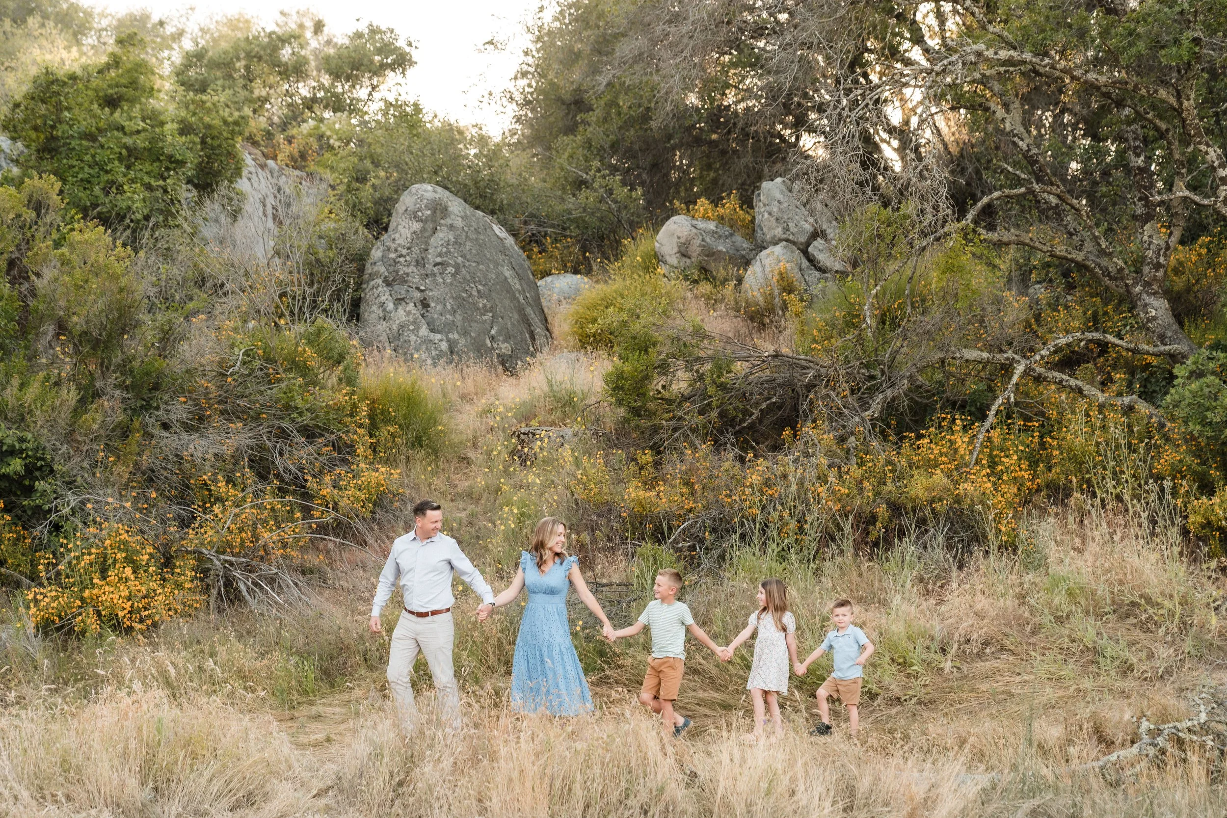
Something I get asked a lot is how to choose your family photo outfits. It seems this is a universally daunting task, so much so that some families skip the photos all together, just because finding outfits feels like too much. So here are my top tips and advice for what to wear and how to go about putting it all together.
Pick your outfit first Mama!
I know as Mom’s our inclination is to take care of everyone else first and leave ourselves for last. But this strategy only boxes you in and leaves you picking something just because it fits with everyone else, and not because you love it. Your outfit is usually the hardest to find, because we are pickiest about what we wear. But if you leave every option on the table for yourself, it will be that much easier for you to decide. Think about outfits you have already worn, and LOVED. What outfits make you feel great about yourself? Pick that one! Now that your outfit is taken care of, this will naturally give you a jumping off point for everyone else. Maybe you picked a neutral with a pattern for yourself, and can find a complimentary color for someone else to add to the mix. Maybe your outfit adds the pop of color and you can stick to neutrals in different textures and patterns for everyone else. No matter what you choose, the rest of your decisions will likely fall right into place.
Combine color, texture & pattern
Most people only consider the color, and forget to use texture and pattern as well. Even if everyone is in the same color, if you add different textures and patterns to it, you will add visual interest and take your photos to the next level.
When choosing colors, neutrals are always the easiest. Creams, grays, beige, taupe…they all are easy to work into coordinated outfits and don’t compete with your surroundings for visual interest. If you want to add color, start by picking one and adding it to one outfit, or spreading it out across a couple outfits with single pieces, like a single top or dress. If you want to know what neutrals go best with the color you want, try searching “x color + neutral color palette” and see what colors other people have put together.
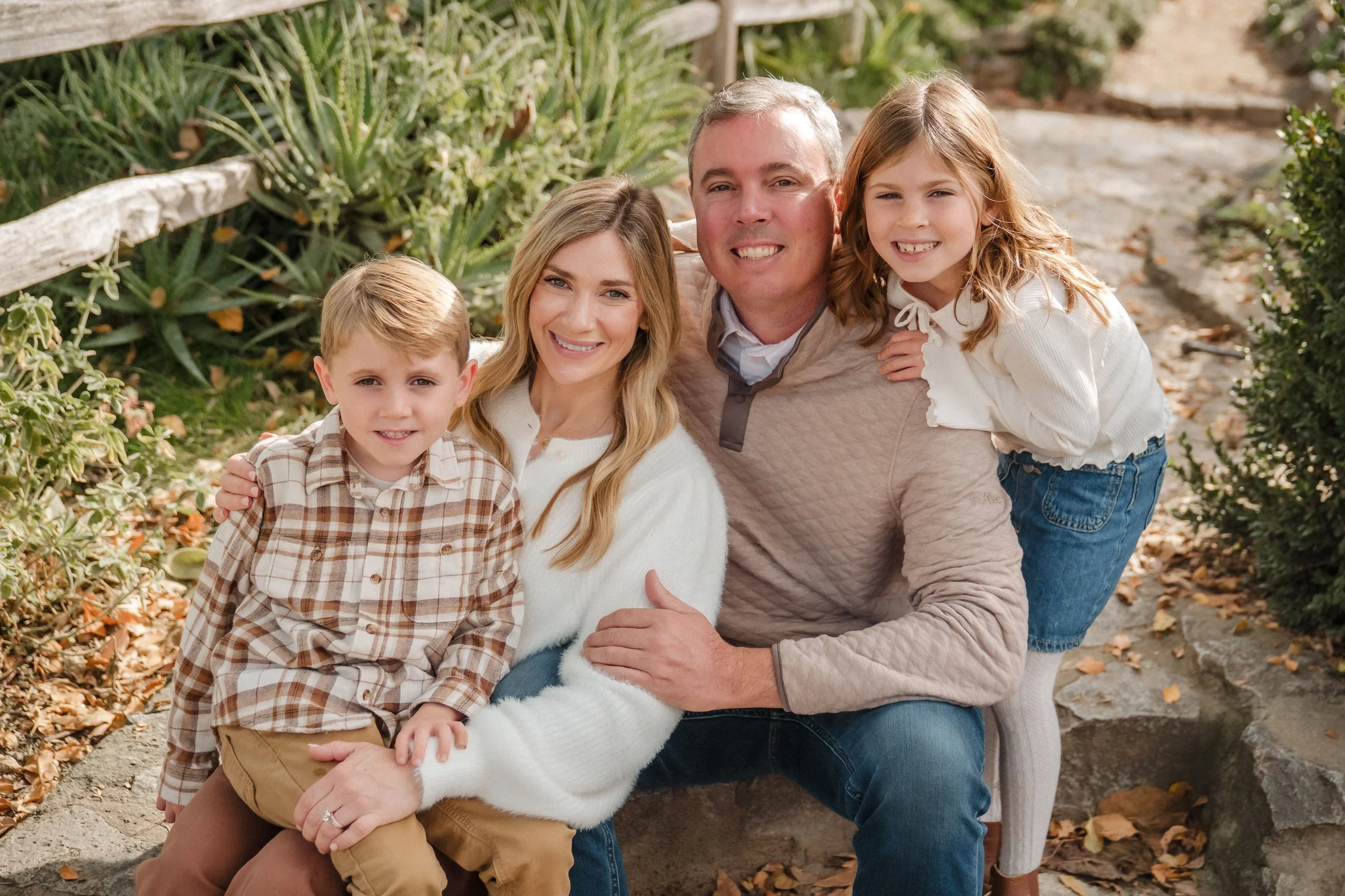
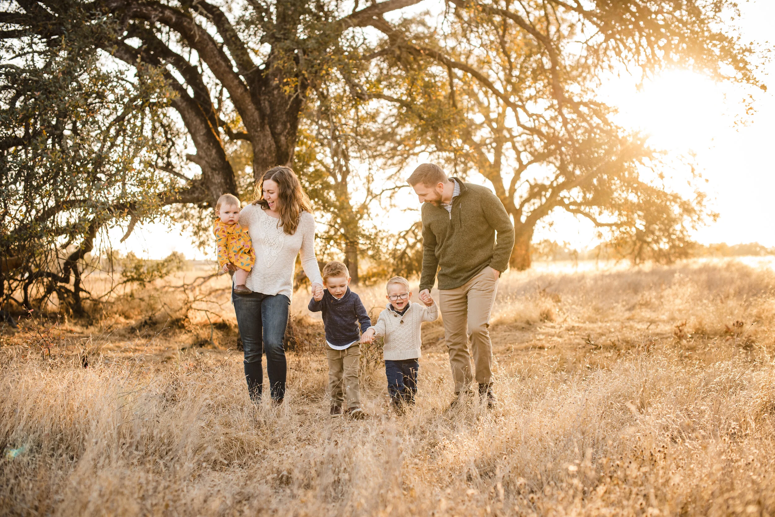
Next, let’s talk texture. I think this is the most forgotten element that but has a very large impact on your photos. Cotton is classic, but there is also denim, corduroy, silk, knit, fuzzy. There are also elements like ruffles and layers that add visual interest. Take a moment to look at all of these photos and see how many different textures you can spot. In the photo above, Mom is wearing a beautiful fuzzy sweater in a neutral cream, Dad is
wearing a neutral pullover with quilted stitching and the kids are wearing a pattern, a subtle ruffle and denim. They all work together to create outfits that coordinate, without being too matching and each member has a unique element to their outfit. Even though there is not a stand out color, the outfits still have lots of visual interest and keep the focus on the family.
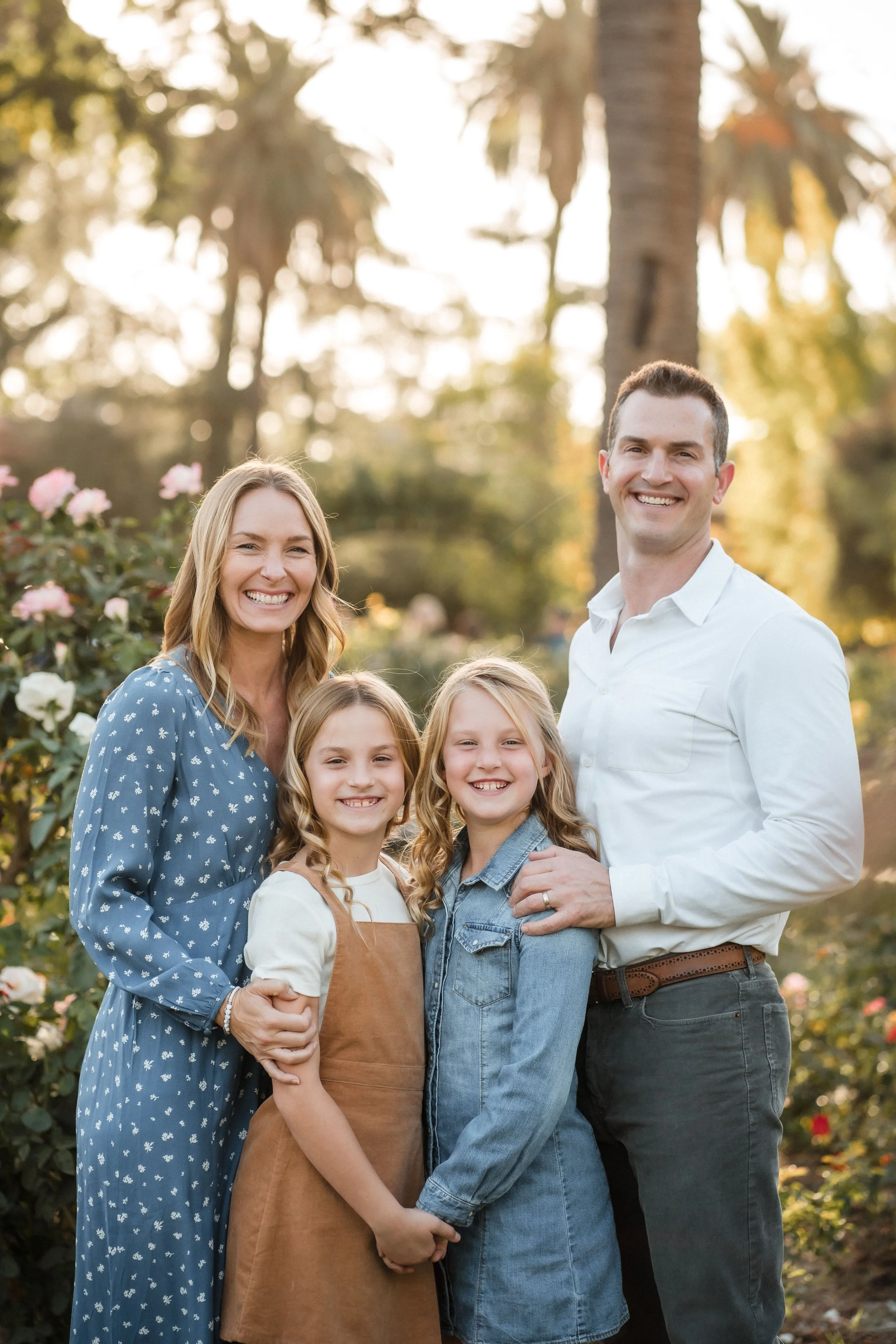
Similarly the family to the right above, has beautifully combine pattern and texture in a simple, neutral color palette. Mom has a subtle blue color dress that features a simple pattern. The pattern isn’t busy, and the color isn’t too bright so she doesn’t take over the image. Both daughters have texture in their outfits, with corduroy and denim, and are in complimentary neutral shoes of taupe and blue. Dad rounds it out with a simple outfit that has bit of texture but allows his girls to be the stars of the show.
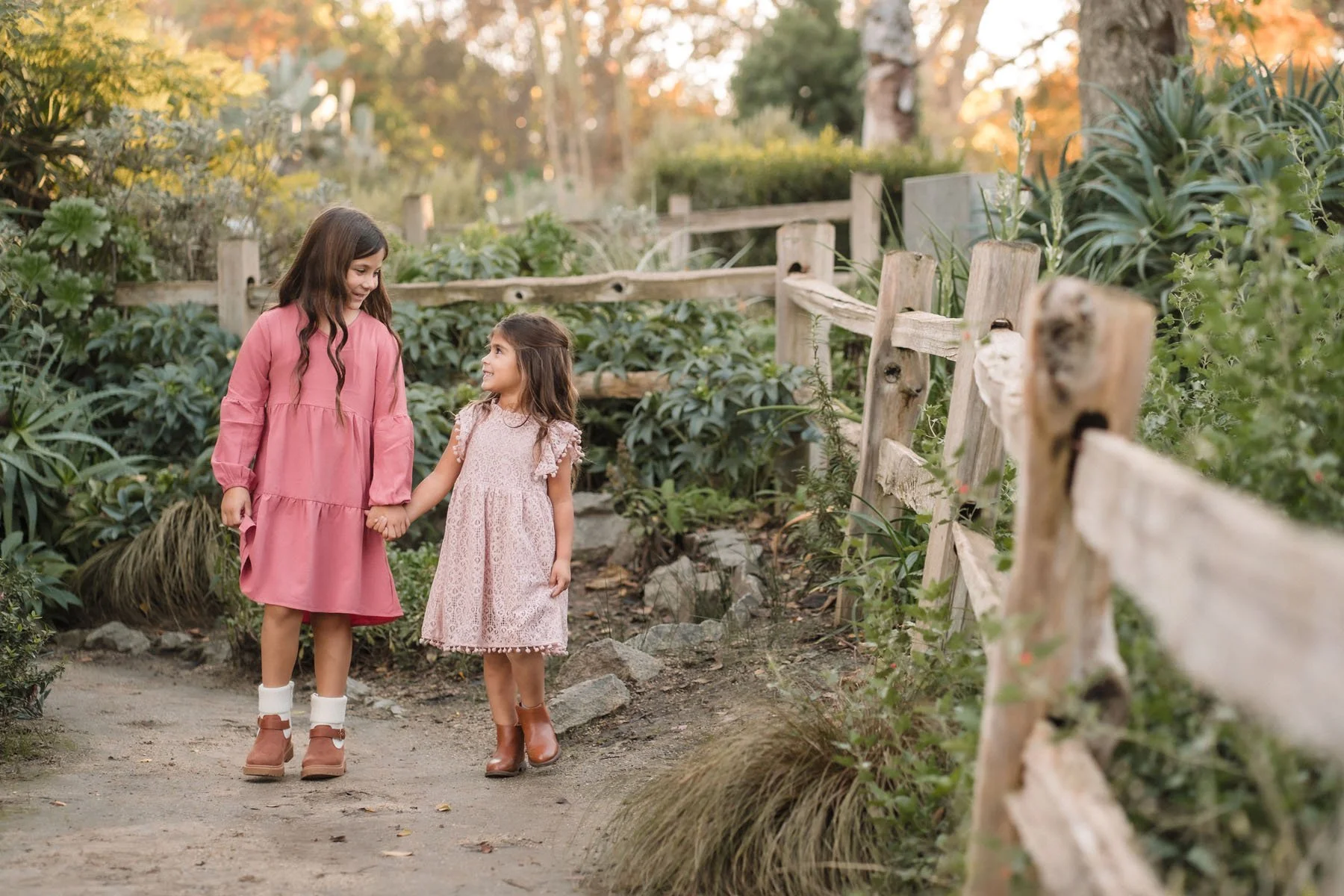
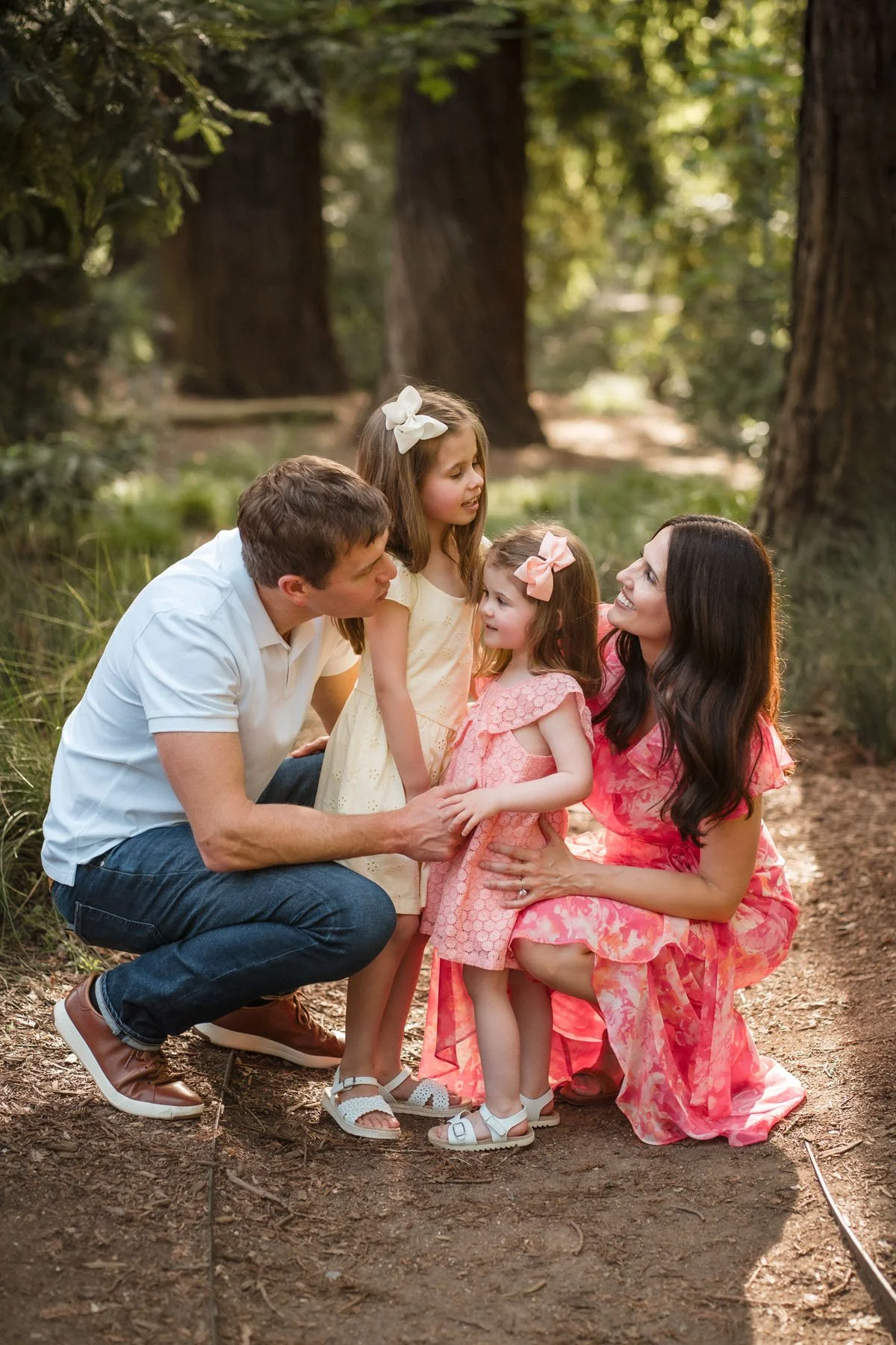
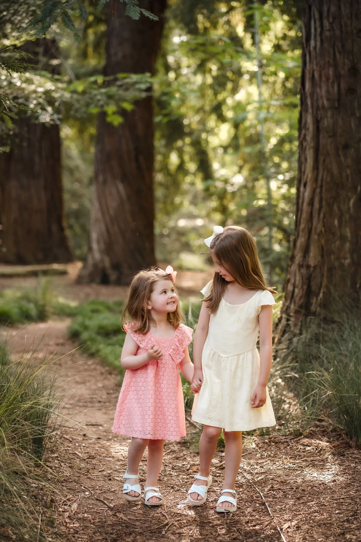
Below you see the little girl on the left has a subtle ruffle and knit texture to her neutral top, and the girls on the right are wearing similar shades of pink, one slightly more colorful and one more textured. Each outfit stands out in its own way without stealing the show and Mom on the right has a beautiful lace detail in her top, but in a neutral shade that matches the surroundings and doesn’t overtake anyone else.
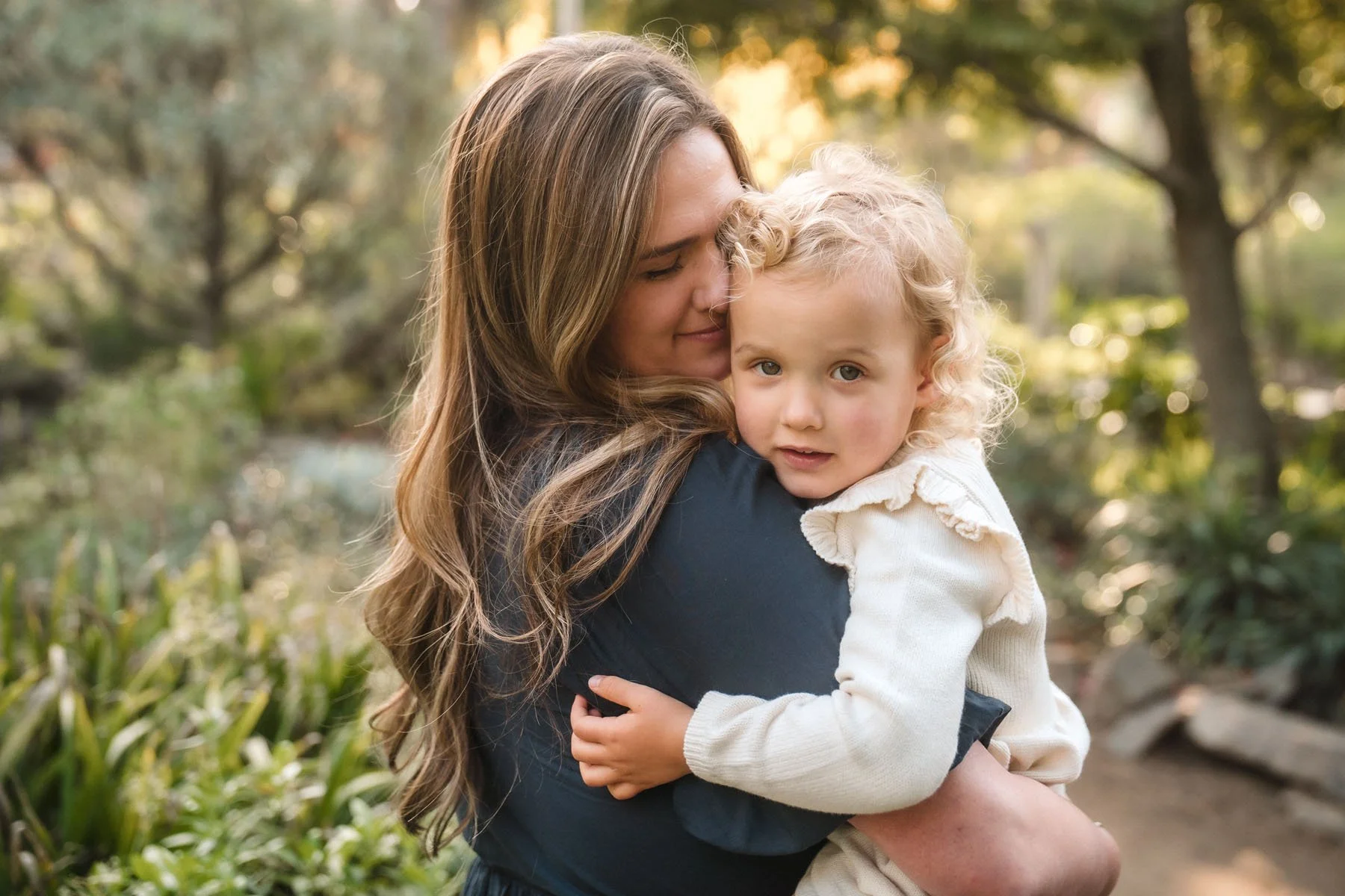
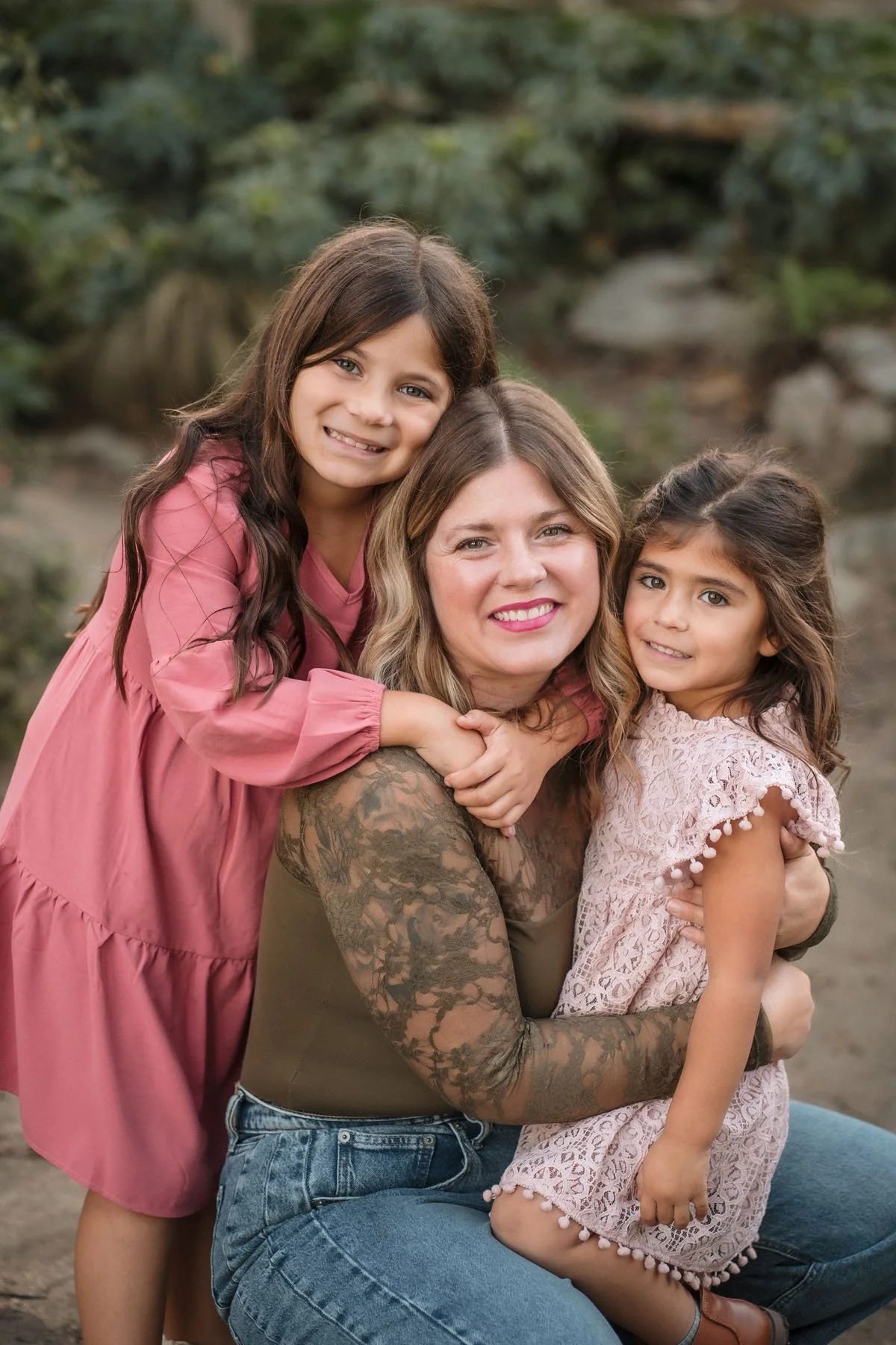
I think pattern is the hardest to incorporate, as it can easily take over a photo and cause a photo to be too busy. Limit pattern to one or two outfits in a photo, and keep them simple. Very small patterns, that are very close together sometimes look strange in photos (think very small plaid, gingham, houndstooth) and I recommend those be avoided. Florals, stripes, plaid (as long as its not a very small pattern), are all great and fun ways to add a unique element to your photos.
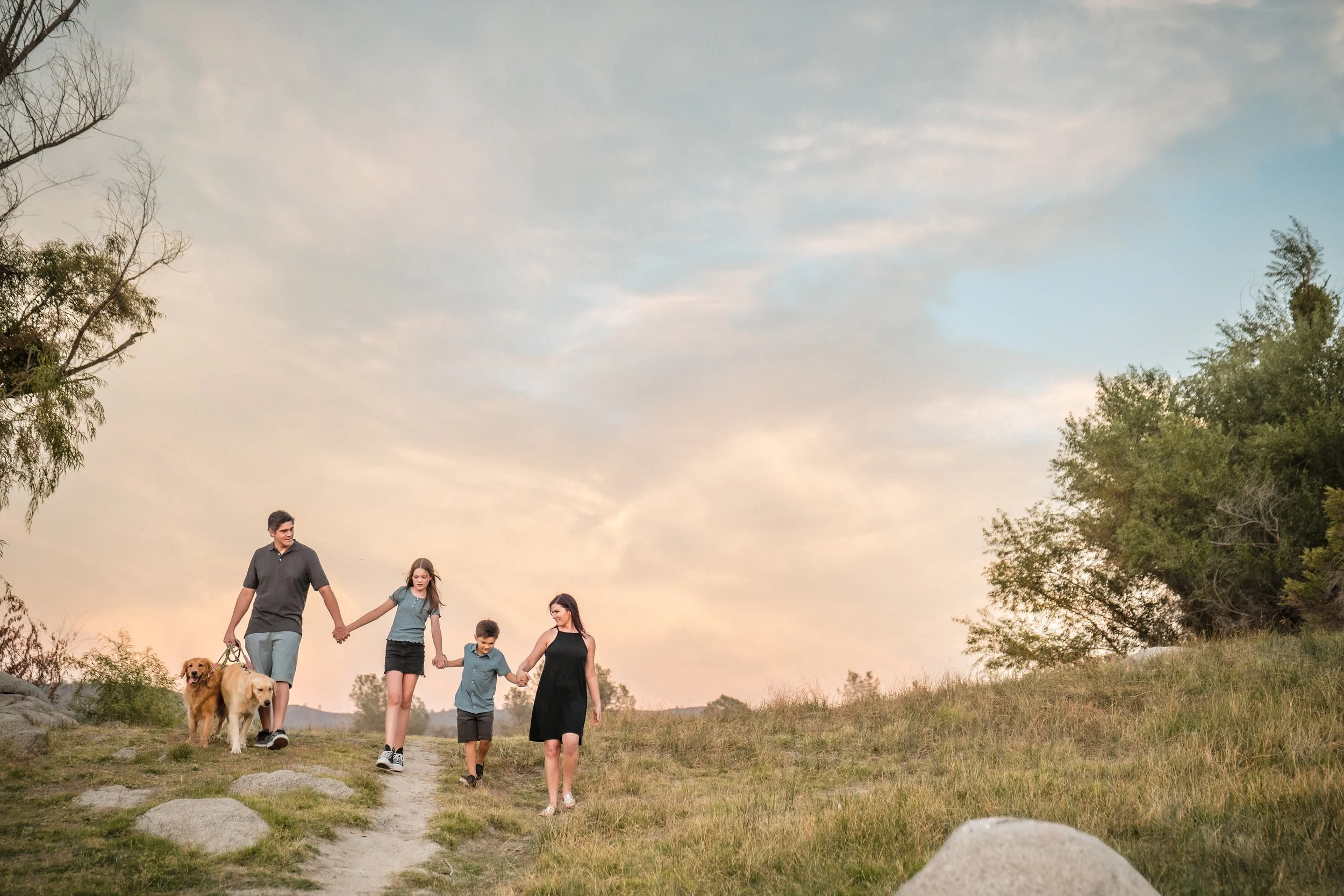
The family below seamlessly combines all three elements of color, texture and pattern. There are blues, a very light green, neutrals, textures of denim and eyelet lace, as well as a plaid pattern. This works because the majority of the pieces are neutrals, with added texture, and only one piece is patterned. There is plenty of visual interest between the textures and the patterns, and no ones outfit is competing with anyone else’s. They all work with the surrounding greenery in a way that feels natural.
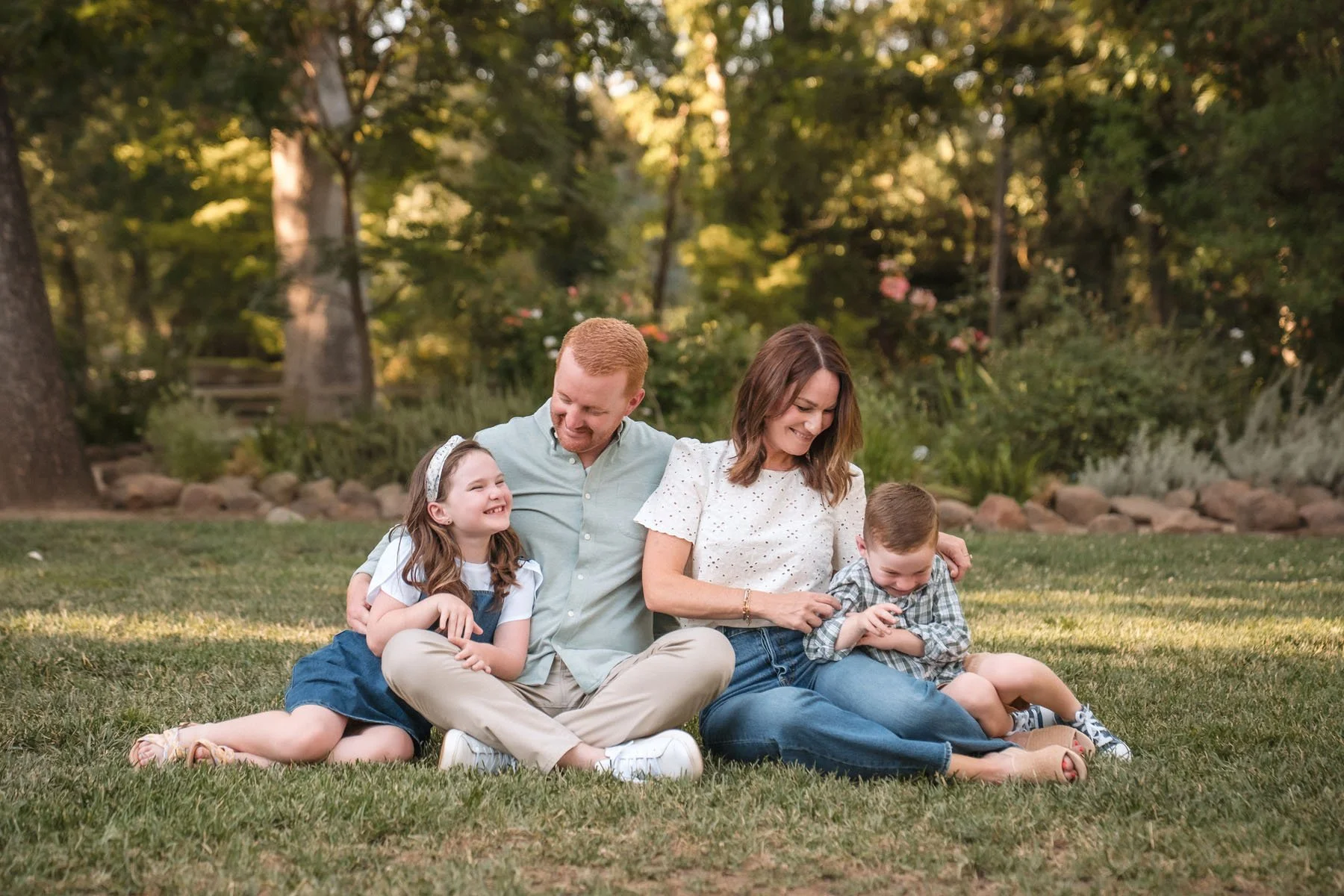

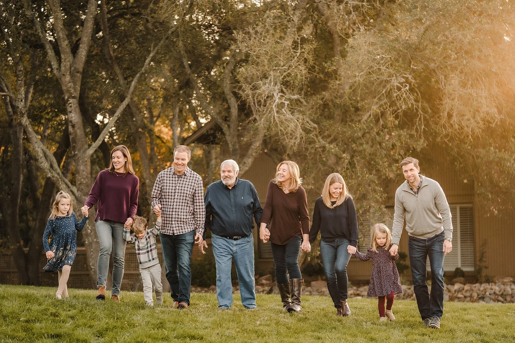
One quick note on pure white. This can be a tricky one because of its tendency to reject light, look very glowy in photos, and pull blue in photos because it reflects the blue in the sky. I find it best to stick to off whites or creams if you are looking for a “colorless” neutral.
Overall, I want you to do what makes you feel amazing. If you love color and want to include a lot of it in your photos, great! If you have a dress you love that is a busier pattern, go for it! At the end of the day these are suggestions for anyone that would like a little guidance. Most of all I want you to LOVE your photos and the only way that is going to happen is if you love what you are wearing.